
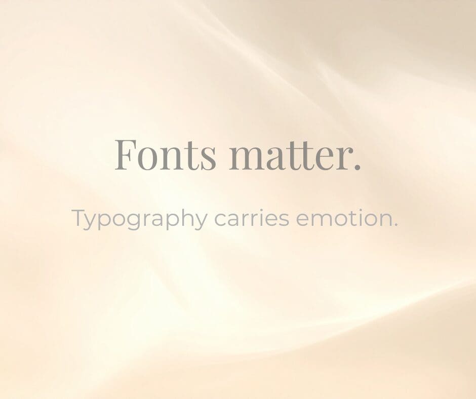
We’ve all seen it: the same words can feel romantic… or aggressive. Elegant… or chaotic. Whispered… or shouted. And often, the only thing that changed was the fonts.
Typography carries emotion long before we consciously process it. It sets the tone for what we’re about to read. It tells us whether to lean in—or brace ourselves.
If you’ve ever chosen an invitation template, you’ve felt this instinctively. Two layouts may look nearly identical. But one feels refined and timeless. The other feels loud. The difference is rarely the wording. It’s the type.
Fonts Speak Before You Do
A flowing script suggests intimacy and warmth, while a crisp serif conveys tradition and trust. Meanwhile, a heavy, distressed font can feel bold—even confrontational.
The message hasn’t changed. But the mood has.
Why It Matters in Everyday Design
You don’t have to design from scratch to choose well. Even if you’re using a predesigned template (and most of us are), you’re still making decisions.
- Is the script legible?
- Does the serif feel classic or dated?
- Does the pairing feel harmonious—or accidental?
Good typography is quiet. It doesn’t scream for attention. Instead, it supports the message and quietly frames the mood.
And in a world where we’re constantly communicating—through invitations, newsletters, social posts, menus, holiday cards—that mood matters.
Choose Intentionally
Before you finalize a design, pause for a moment.
Ask yourself:
What do I want this to feel like?
Romantic?
Joyful?
Understated?
Modern?
Nostalgic?
Then choose the font that whispers that emotion before the words even register.
Because beauty lives in details.
And fonts—though small—are never neutral.
Planning a gathering, shower, or celebration this season? Let the typography set the tone before guests ever arrive.

+ Leave a comment
back to pretty