
We couldn’t fit every beautiful room into the pages of Pretty. Take a closer look inside this thoughtfully collected home, where soft color, classic details, and plenty of personality come together.
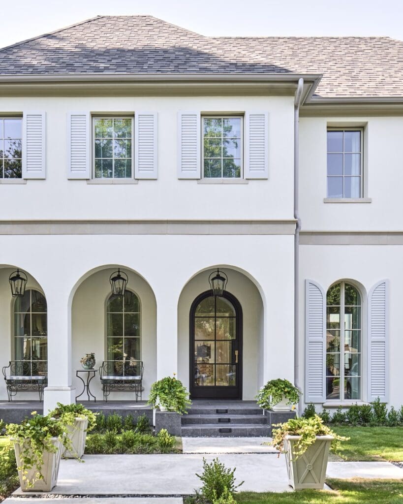
There’s a hint from the very beginning that this isn’t going to be an all-neutral affair. Inside the classically elegant exterior, designer Philip Thomas Vanderford created a home that feels traditional without feeling predictable, layering color, pattern, antiques, and personal pieces throughout.
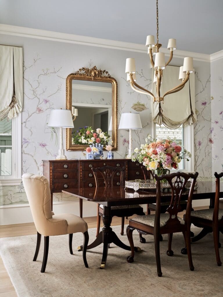
The dining room sets the tone. Delicate floral wallpaper provides a soft backdrop for darker antique furnishings, while gilded accents and fresh flowers add warmth. Rather than matching perfectly, the furnishings look as though they’ve been collected over time—an approach Vanderford embraced throughout the home.
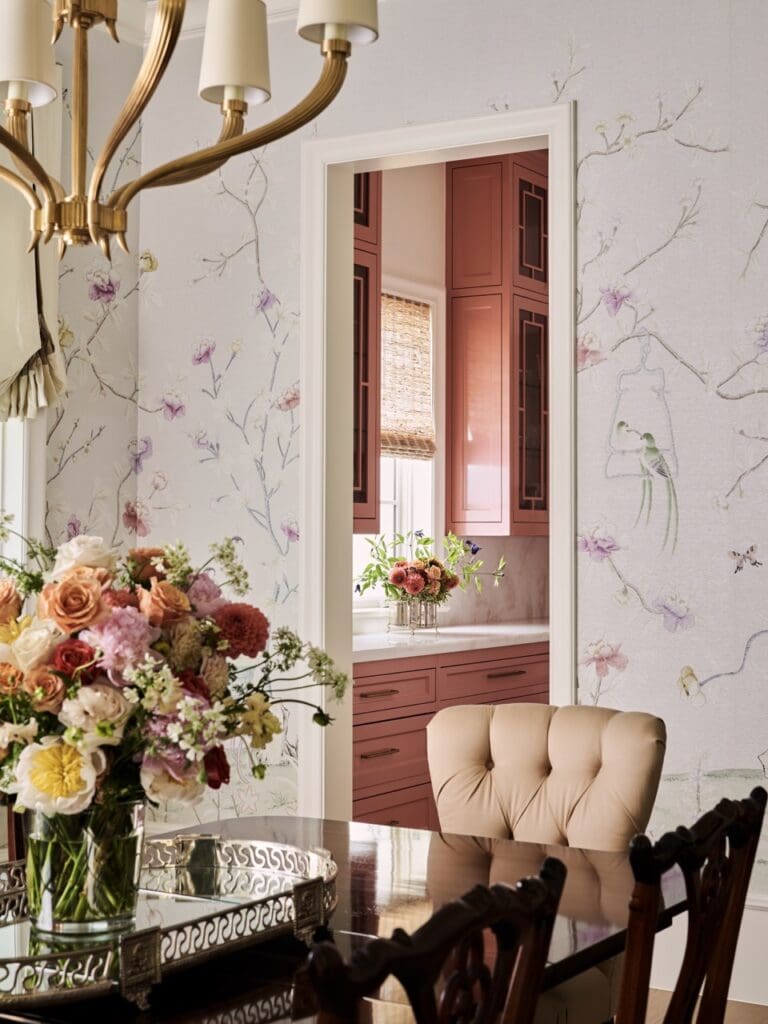
And then there are the glimpses of color from one room to the next. Here, the rosy cabinetry beyond the dining room becomes part of the view, connecting the spaces without requiring them to match.
That willingness to use color confidently was key to the design. As Vanderford told Pretty, the secret to decorating with pink is “choosing the right tone and using it with conviction.”
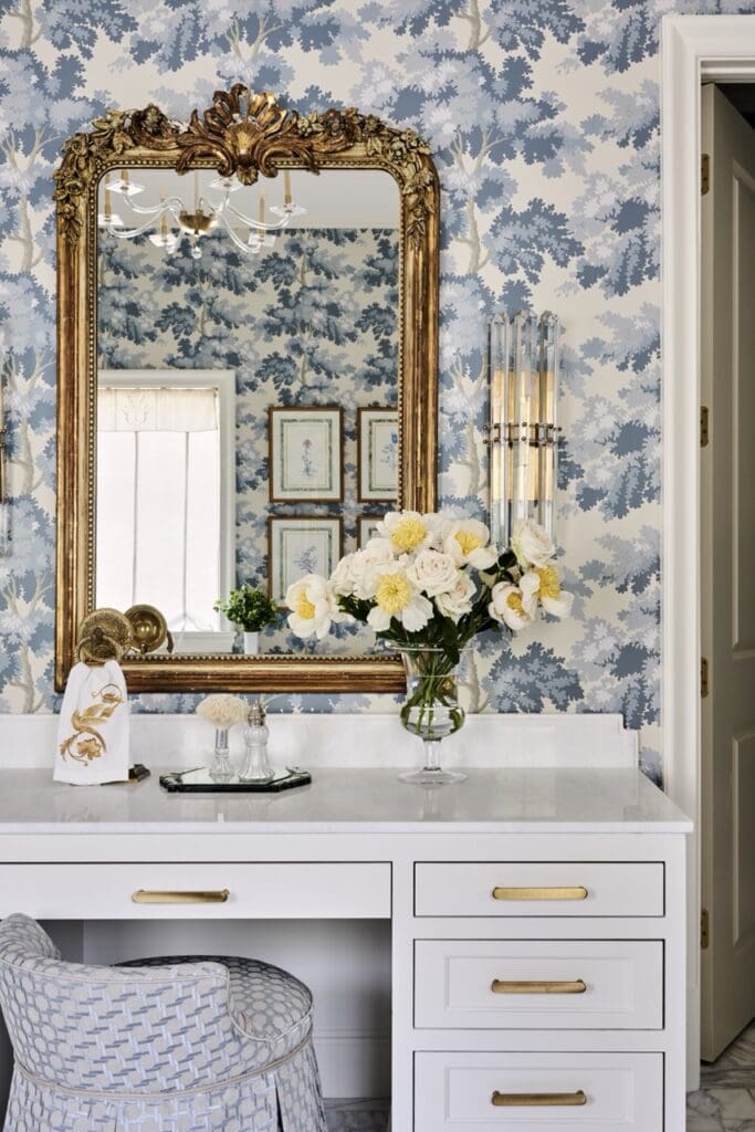
Pink may get top billing, but it certainly doesn’t have the house to itself. Blue and white make an appearance, too, including this charming vanity area, where traditional floral wallpaper, brass hardware, and an ornate mirror give the space an almost jewel-box quality.
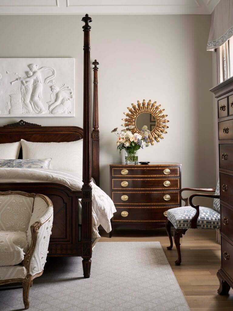
This bedroom is quieter. Rich wood antiques and an elegant four-poster bed take center stage against a subdued backdrop, proving that the home’s personality doesn’t depend on bold color in every room.
The contrast is part of what makes the interiors feel collected rather than decorated according to a formula.
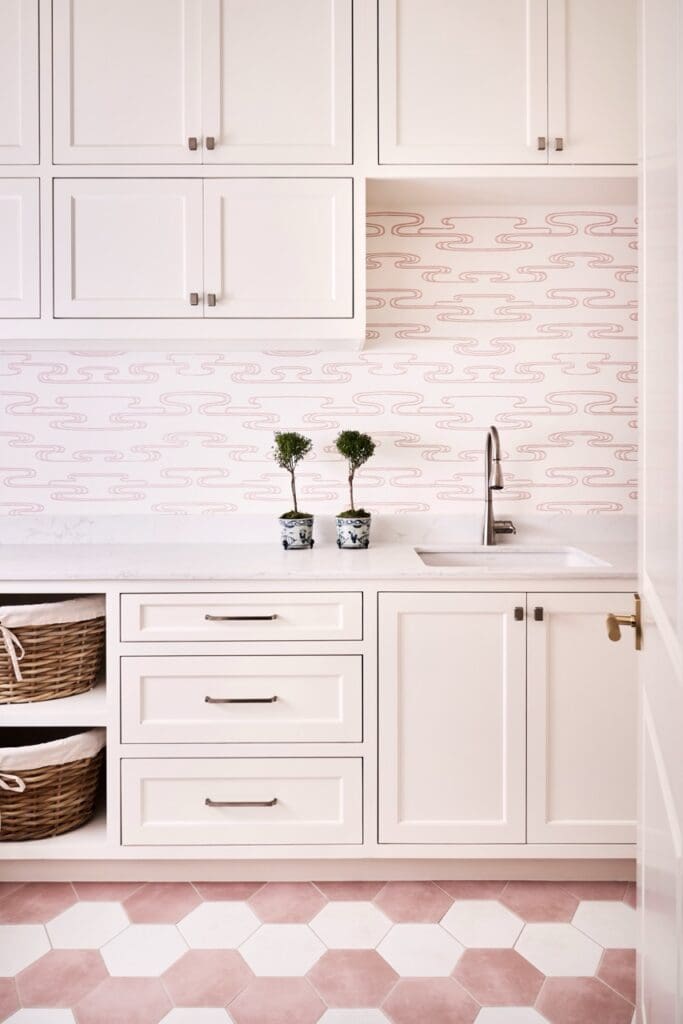
Then pink returns—this time in a fresh, playful way. Pale cabinetry, patterned walls and a geometric floor turn a hardworking space into something worth lingering over.
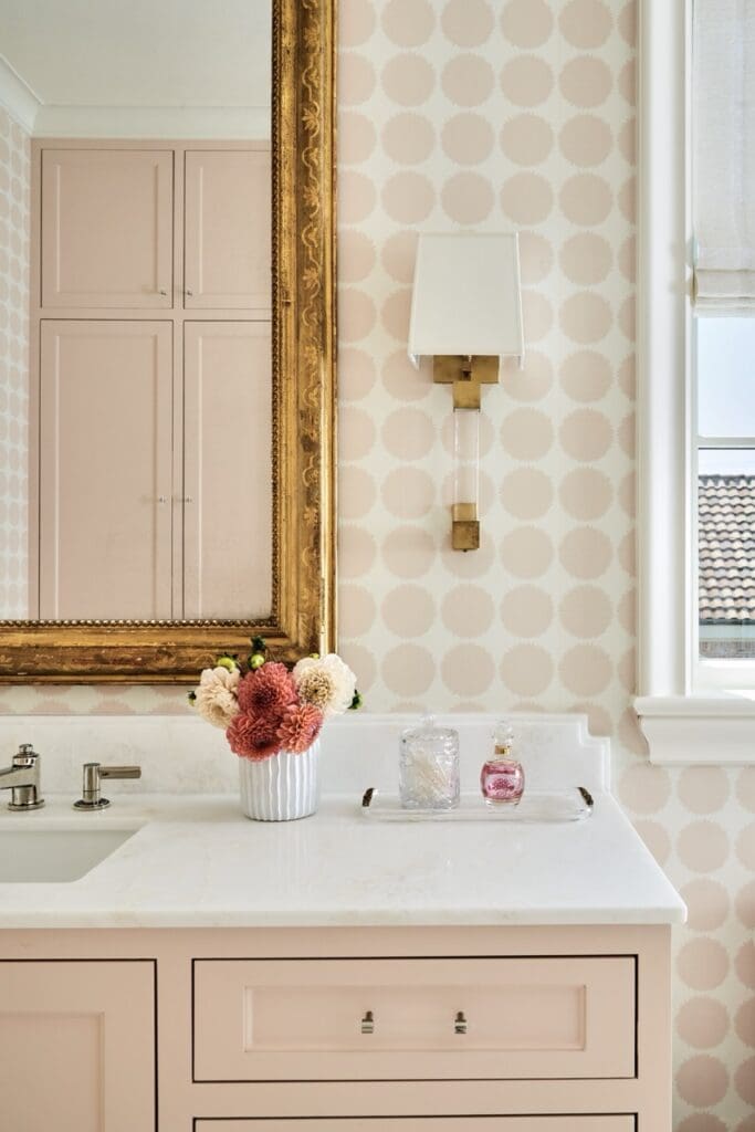
Even the smaller moments get attention. A simple vanity becomes special with oversize dotted wallpaper, a gilded mirror and warm brass accents.
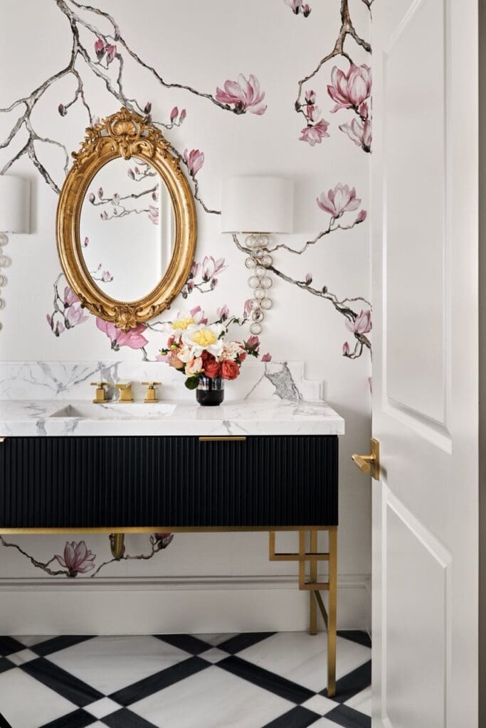
Elsewhere, Vanderford turns up the drama. Large-scale floral wallpaper, a black reeded vanity, marble, and a gilded mirror create a powder room that feels completely different from the space before it—and that’s precisely the point.
A memorable home doesn’t have to repeat the same idea from room to room.
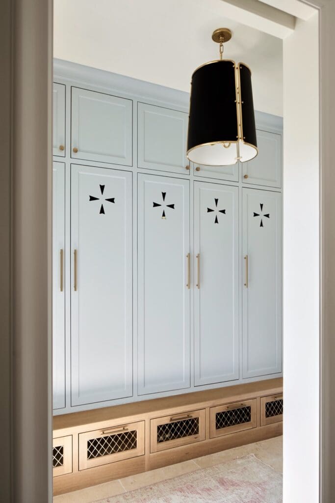
Soft blue cabinetry offers another change of mood. The color is subtle enough to function almost as a neutral, while the cutout details and black-and-brass light fixture keep it from disappearing into the background.
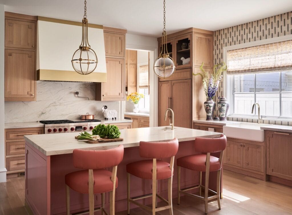
The kitchen brings the home’s palette together in an especially inviting way. Natural wood cabinetry and creamy stone provide a warm foundation, while the rosy island and counter stools introduce color without overwhelming the room.
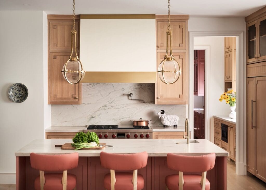
It’s also a good example of Vanderford’s advice for anyone hesitant about decorating with pink: look for muted, complex shades and pair them with natural stone, rich woods, antiques, and classic architectural details. Those materials help the color feel at home in the architecture rather than added simply for effect. Brass, veined stone and beautifully detailed cabinetry give the kitchen a sense of permanence.
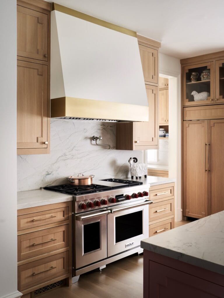
And sometimes the details deserve their own close-up.
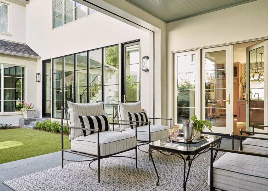
The tour ends outdoors, where the covered porch continues the home’s mix of classic architecture and comfortable living. Black-and-white furnishings keep the space crisp and simple, while wide glass doors visually connect it to the rooms inside.
For Vanderford, though, the most successful part of the house isn’t any particular color, fabric or furnishing. It’s that the rooms reflect the people who live in them.
“Some of the most memorable spaces aren’t filled with the newest furniture—they’re filled with things that tell the story of the people who live there,” he told Pretty.
And after one more look around, we think that’s a pretty good place to end the tour.
Photography: Studio Thomas James

+ Leave a comment
back to pretty